Hungry Beast
hungry beast
"It's a matter of focus, if you believe your world is formed by what you look at, and you just don't look at the usual things, then your world will change" To this end, defying the rules becomes a sort of "learning by doing" situation." - John Baldessari
Hungry Beast is originating from the need to create a café and a place where health meets casual. It was designed with a big personality, a focus on health-conscious, but wanted to avoid the in your face attitude of most commonly associated with the health trend. It is beyond a fad; it is about the simplicity in providing quality products, healthy ingredients and creativity in preparation.
The concept for this health-conscious restaurant and juice bar was to connect the natural flow of the street to the interiors.
In this multi-use spaced, there is a feeling of comfort, efficiency and offers an ambiance that feels organic and modern. The materials such as stucco, the volcanic stone floor and solid woods with a natural finish and with a warm tone were chosen in order to contrast with metallic materials and dark colors. The design offer another contrast from having various plants and having open design in order to allow the natural light from the city into the space
Through the visual elements, and materiality of the space, we were able to create an atmosphere that felt authentic and honest. Quality and simple materials such as wood and clean lines were maintained in the small space to let the ingredients stand out.
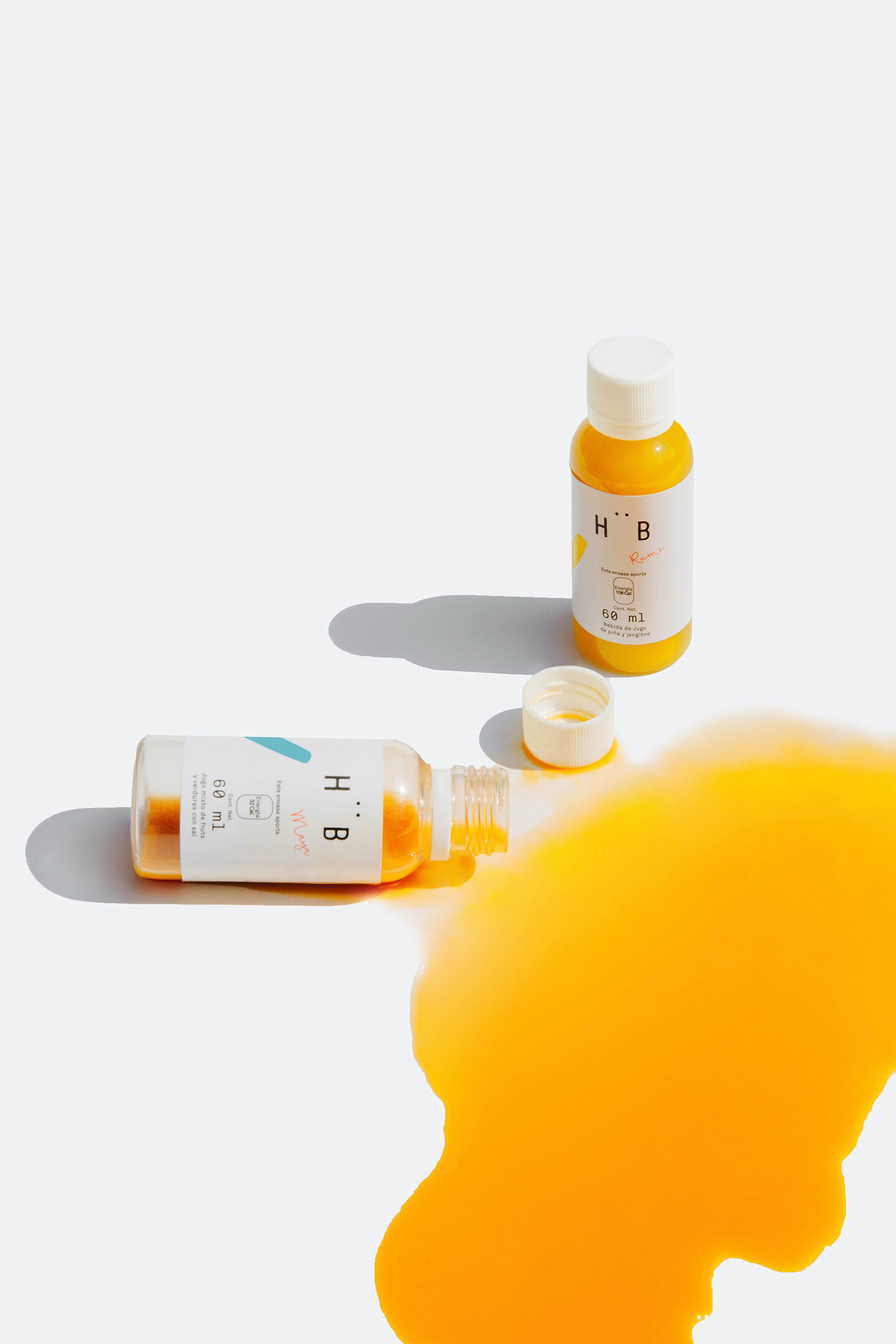
This idea is reflected in the choice of visual representations for the brand. Baldessari’s Connecting Dots and Gemini series were the main inspiration for the branding element. Through stripping back packaging elements to their core with a simple abstract detail of color reminiscent of Balderassi’s Gemini series.
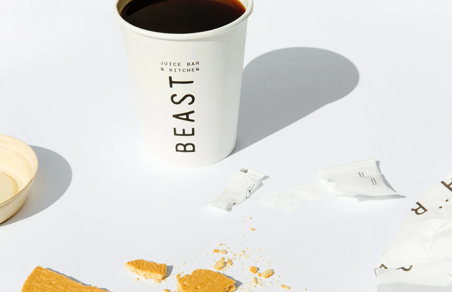
The visual applications such as the boxes and the take-away bags were kept with the name of the restaurant standing out as the main element. Adding haphazardly throughout the various elements, from the cups, to the boxes, to the napkins and to the tote bag. The elements add a feeling of fun and light-heartedness to the brand. It is about taking health-food not too seriously.
We custom-designed all of the furniture and structure as to make the restaurant feel organic.


