Marla Aaron
marla aaron
“Functional Maximalism; a story of beauty”
A decadent retreat into a private world of fantasy – a world where art does have to do with the everyday utilitarian objects, certain objects that serve a purpose should be able to be called art.
– Oscar Wilde meets Adolf Loos for tea.
A contradictory universe: ornamental and utilitarian, getting closer to the boundaries between functionality and beauty.
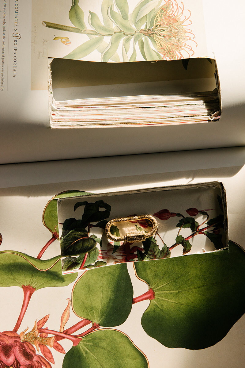
Our creative concept behind the brand development for Marla Aaron was based on a functional Maximalism – a story of beauty – inspired by her own approach to jewelry design.
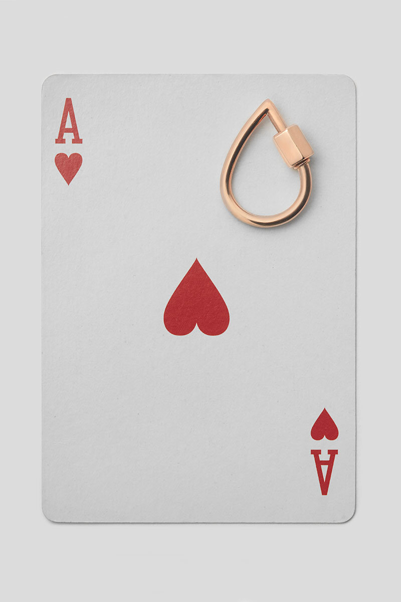
Marla’s roots are based on the detail of function. A solid and quotidian inspiration borrowed from the hardware stores in New York City, translating those forms into beautiful jewelry and statement pieces.
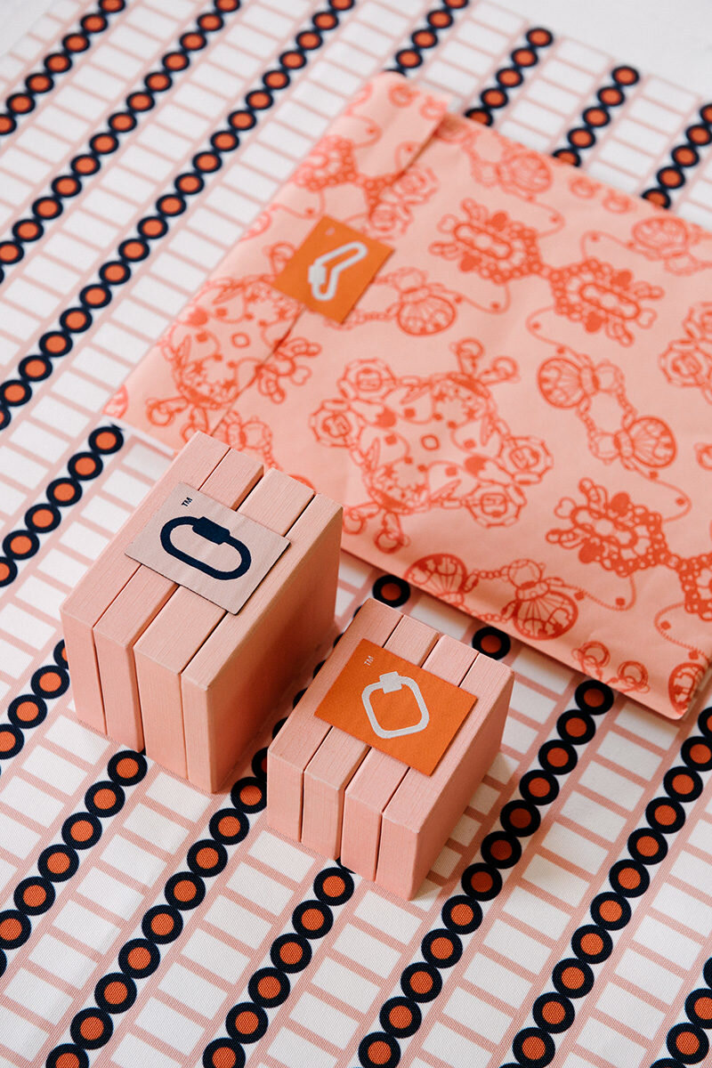
The logo mark is a result of the union of pieces, concepts and connections – Brancusi's The Kiss, for example, was a clear starting point. Through this visual language we manage to translate a certain decor and maximalism into the almost mundane and ubiquitous world of tools and practical objects.
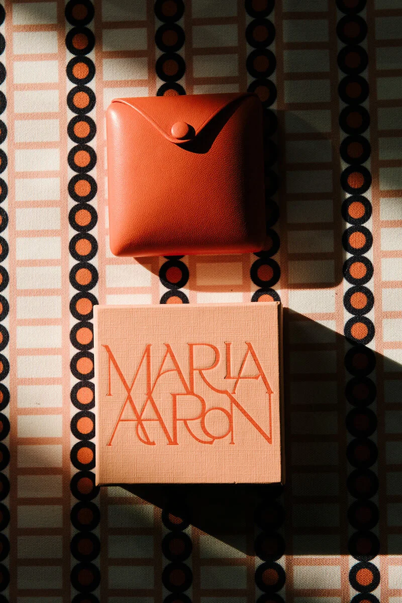
In order to support the branding system we developed a series of patterns that take cue from the shapes of Marla's jewelry, stating how true beauty comes from a basic form, simple as it may be, but which can be interpreted into a much more intricate aesthetic. There is also an element of psychedelia, inspired on some of the pieces which are made from superimposing layers of car paint.
Marla's brand was always meant to be rebellious and sophisticated, so through the graphic identity we managed to find our perfect visual balance.
WEBSITE
Photos by Adrianna Glaviano.


