Clover Grocery
clover grocery
Clover Grocery is a health-and-style bodega in the heart of Manhattan's West Village.
We extended the Cafe Clover brand into a bodega-style greengrocers that would offer an array of fresh products, a juice bar, coffee and take-away healthy food options, as well as other foods and beauty essential from around the world.
We wanted the store to give a nod to a traditional shop, but to introduce a fresh and modern
feel to the market-shopping experience.
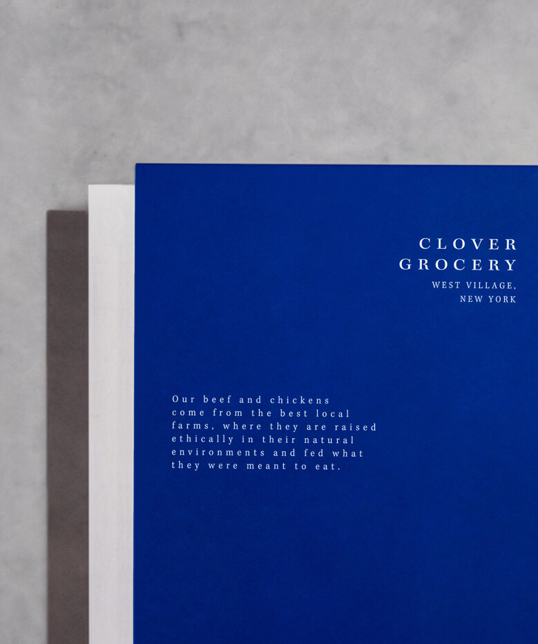
The iconic blue was used as a continuation of the brand, reinterpreting it in a classic yet contemporary identity.
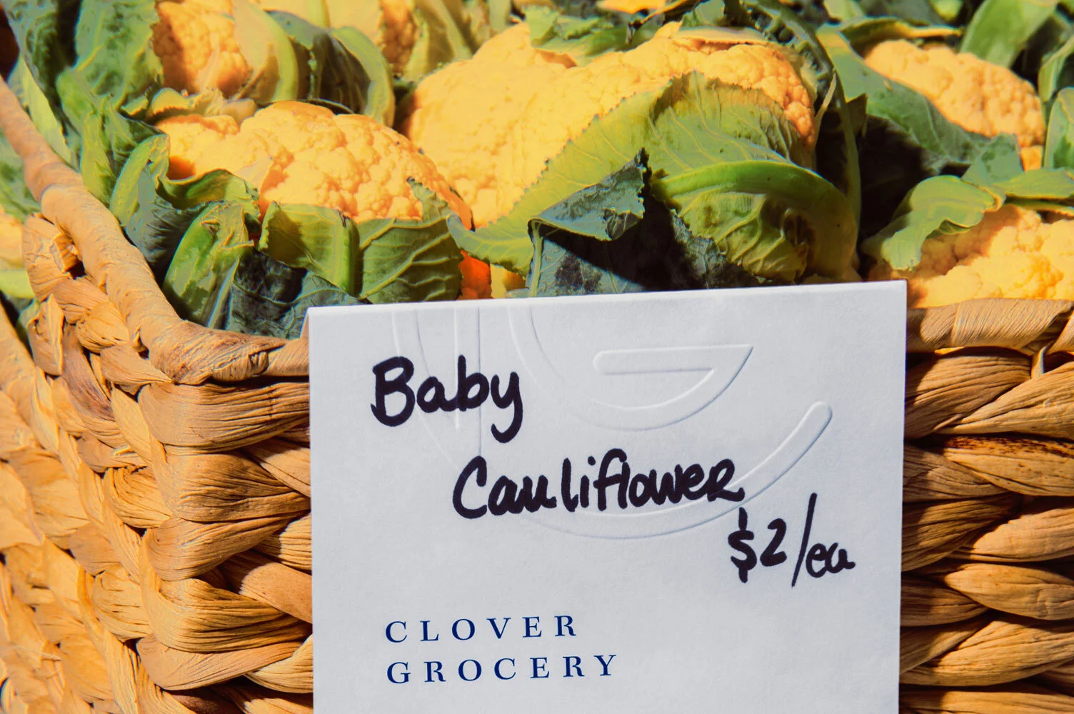
We then introduced a mixture of typefaces to play on the traditional and the current, by creating a blend between a crisp primary typeface and a handwritten element, thus adding a human touch to the system.
For the space, we developed custom furnishings to achieve an organic feel and a naturally created environment.
The two main elements are the centre table – the heart of the grocery – and the seating surrounding it.
The table was designed to change easily in size and structure allowing flexibility for the space with the key design feature being an easy assembly. After many explorations, the final product resulted in a Clover blue and white table that is clean in build but approachable and warm. The seating was ergonomically tested and developed using natural materials such as wood and premium leather.
For the packaging, we used a fresh contrast of blue over a white background, delivering a peaceful retreat during the shopping process.
In addition, we ensured that the purity of the products shone best against an elegant white label.
Every packaging tells a story, outlining every benefit and quality of the product in a modern and stoic serif Kepler font that is accented with a monospaced sans serif Letter Gothic.
We wanted to ensure the experience to be consistently warm and approachable, and as authentic as possible.
Therefore, we developed an in-house printing system with specifically designed stickers that require handwritten product names and descriptions.
The perfect personal touch against the modern Kepler font,
created a warmer more emotional response to fresh foods and a timeless feel.
Photos from interior by Fran Parente.


