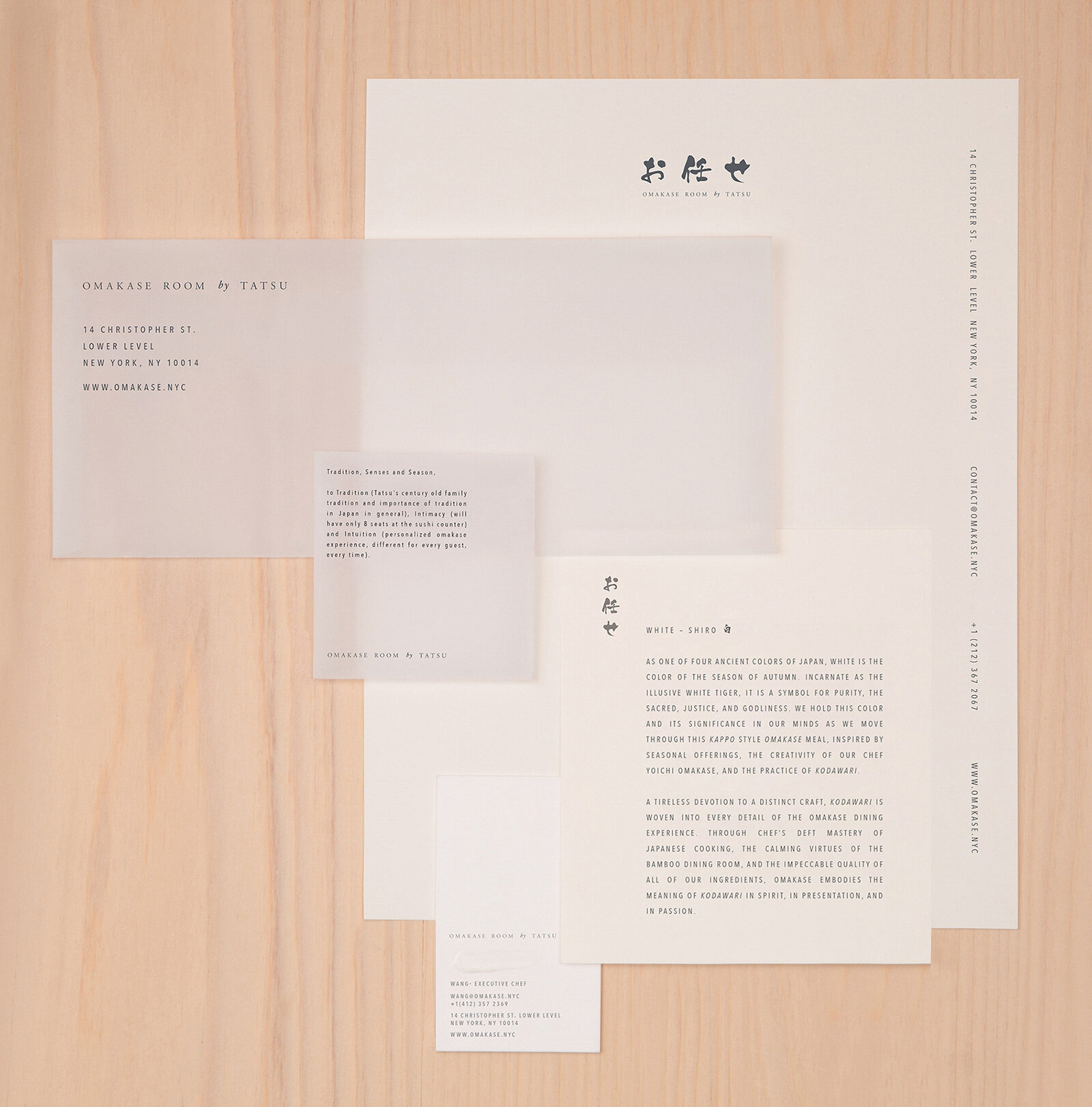
Omakase Room by Tatsu
omakase room by tatsu
Omakase Room by Tatsu is an intimate, chef-led sushi bar experience in New York’s West Village.
As an omakase restaurant, where the chef creates a personalized menu for diners,
we wanted to focus the overall concept on chef Tatsuya Sekiguchi and his mind.
The result is an ambient, sensory experience that allows the food to shine.
In English, we used the font Avenir Next Condensed for a clean, non-distracting effect,
and widened the kerning for an open, contemporary feel.
For the Japanese kanji, we used the brush font Kouzan Gyousho that, like today’s great sushi chefs,
is rooted in tradition but expresses itself through freestyle.
To round out the experience beyond simply the sense of taste, we collaborated with ceramics artist Perla Valtierra and conceptual perfumer Barnabé Fillion on a scented ceramic disk that is gifted to diners at the end of their night.
The disk changes color and scent according to the season, and attunes the diner to the five-season cycle of Japan: spring, summer, autumn, winter and doyo, an 18-day period of transition that falls in between each of the other seasons.
To start with, the first essence is pure hinoki, a cypress tree native to Japan, that is prized for its woodsy, citrusy scent that grounds the body but opens the mind spiritually. Gifted in rice paper, the traditional material for Japanese calligraphy,
the disk allows the overall experience to linger with the diner after they have left the restaurant.
We wanted a clean backdrop that allowed the color to come from the food, not the stationery.
To achieve this, we deployed a color palette of muted, neutral hues that are quiet, calming and discrete.


