
Index Art Book Fair

INDEX ART BOOK FAIR
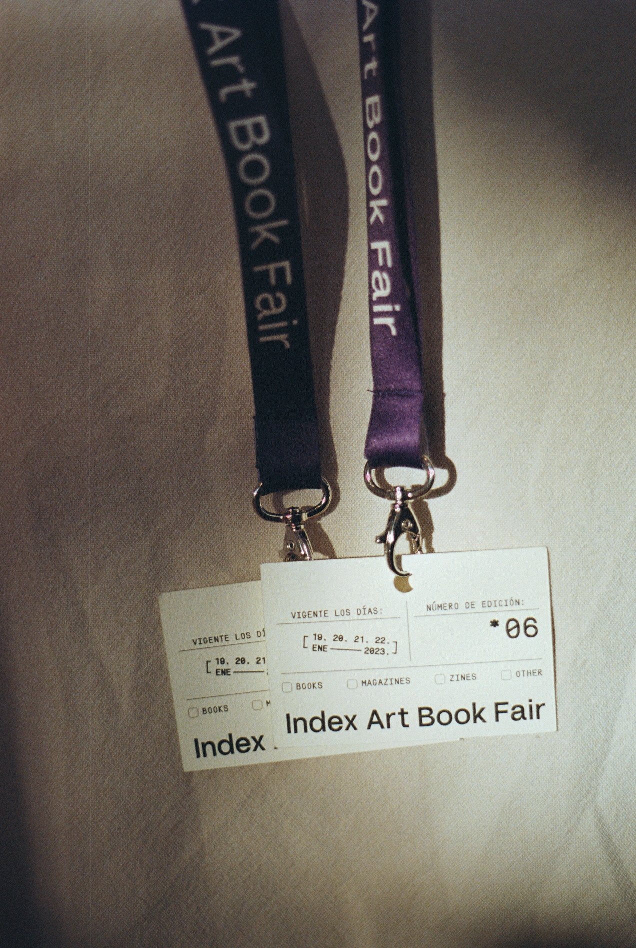
For Index Art Book Fair's sixth edition we developed a conceptual exploration based on a functional study of classical and practical styles found in library cards, a narrative which aludes to an exchange – not only physical through books themselves – but also of ideas, conversations and knowledge.


The graphic identity is strongly based on this concept, borrowing practical typographical references, colour hues which reference a passing of time and a freedom of organised layouts that convey the idea of date stamps which are so characteristic on library cards. In this way, the identity achieves an interesting duality between modernity and tradition. The logo itself was carefully worked integrating white spaces to represent the idea of an open book.


The identity's essence is materialised through the combination of a rigid gridded structure with a clash of freedom – through the use of stamps – to arrive in a graphic system which is both functional and relaxed.


