
Sabzi

SABZI
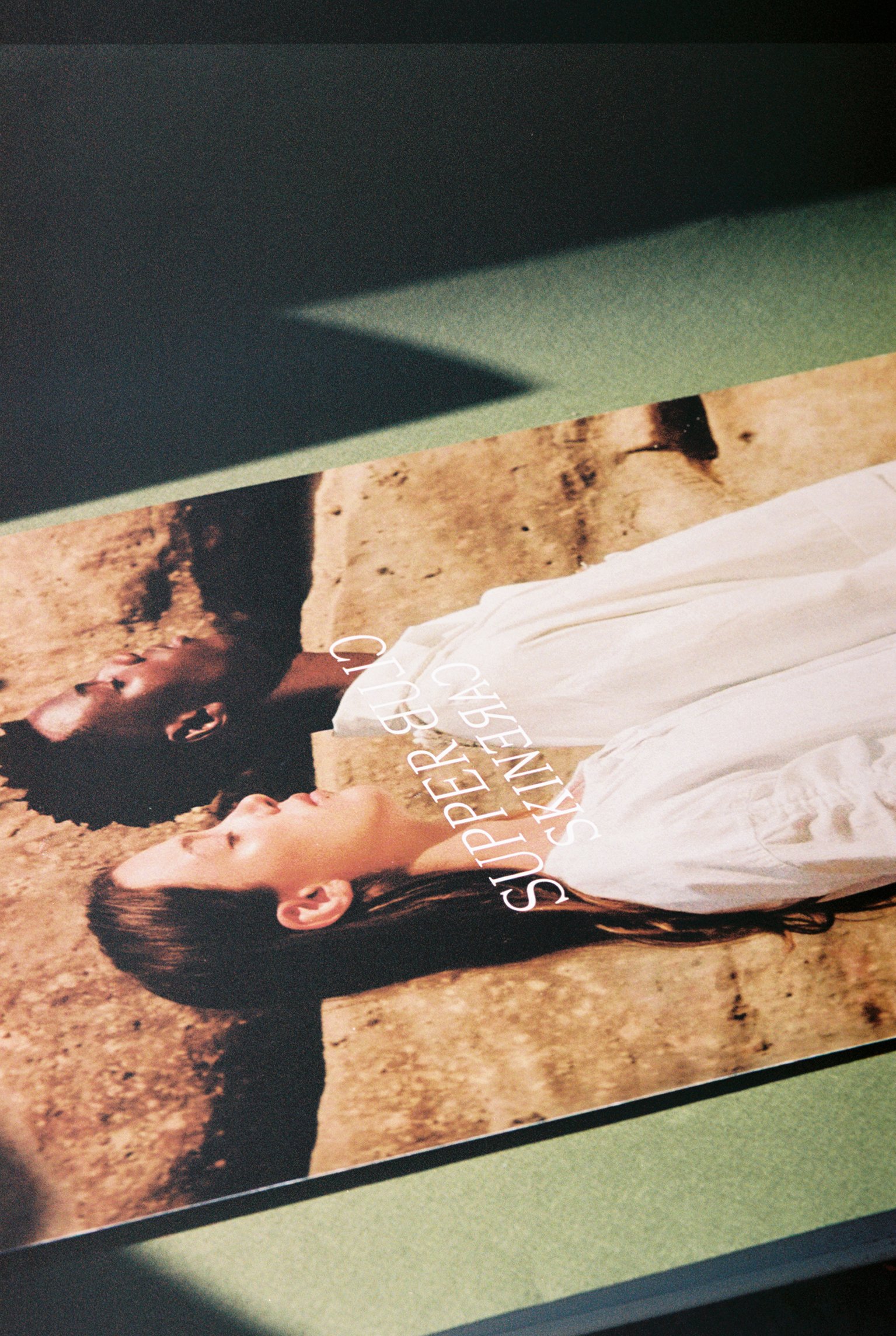
Supper Club Skincare is a London-based beauty brand with a rich Iraqi background.


Launched by brother and sister duo, the products are slowly and meticulously crafted and developed around common spices and ingredients which were a staple in their day to day family gatherings, sitting around a traditional octagonal table. All ingredients are of such high quality that they are even food-grade certified, amongst many other qualifications. Their concentrated approach means Supper Club products will only come out one by one and after just the right amount of time, Sabzi being the first of this new family.


Using knowledge and wisdom that is passed down through generations, Supper Club lives on the border between complementary worlds, putting forward a food-based culture that brings people together.


The branding concept merged heritage into the contemporary, an idea that grew from the inside and now manifests itself on the outside.
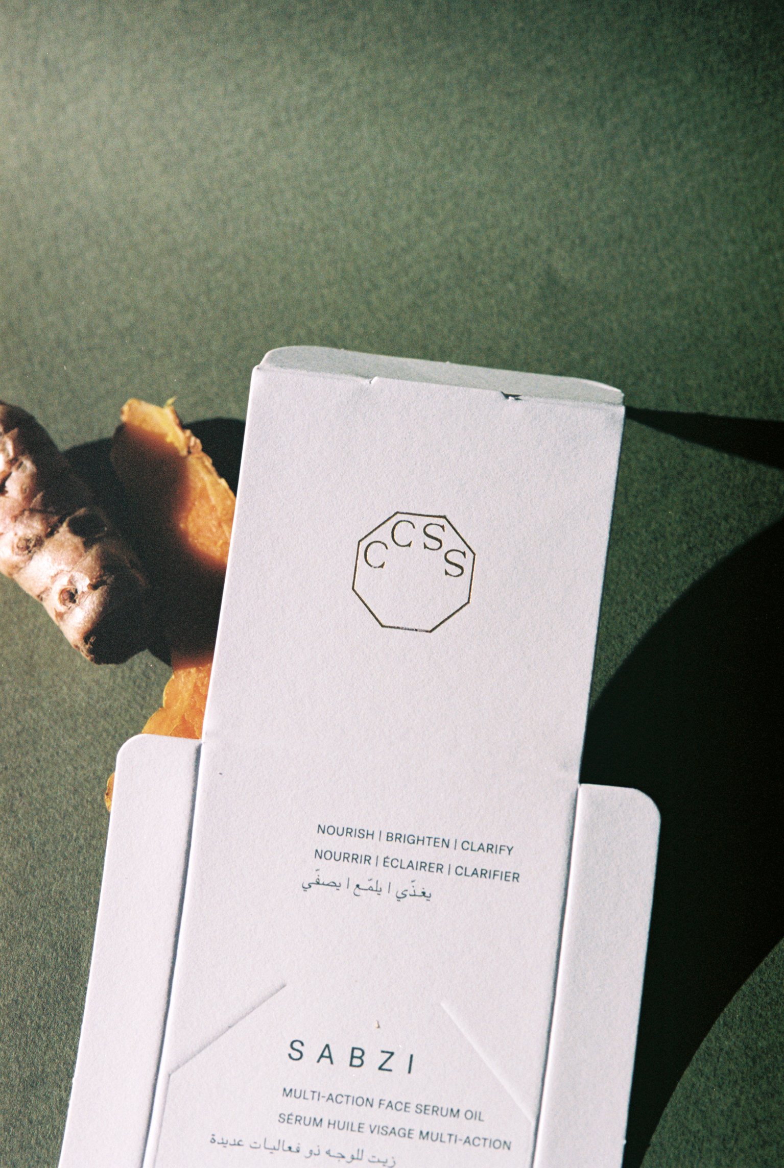
The logo uses a modern serif to add elegance and a delicate feeling, alongside a simple but characteristic icon that is also refined and contemporary at the same time, inspired by the dinner table's octagonal shape and compressing that logo's natural trapezoid format, compressing and reducing it to its core elements, the two opening S's and closing C's.


Using English and Arabic, drawing a dynamic inspiration from how both languages are written in different directions, underlines the concept of bringing two cultures together. The first half of each line facing right and the second half facing left, meeting in the centre, representing this balanced union.
The origins are always present.
The type system also follows the same rules, creating dynamic and flowing layouts through the combination of both styles of writing.
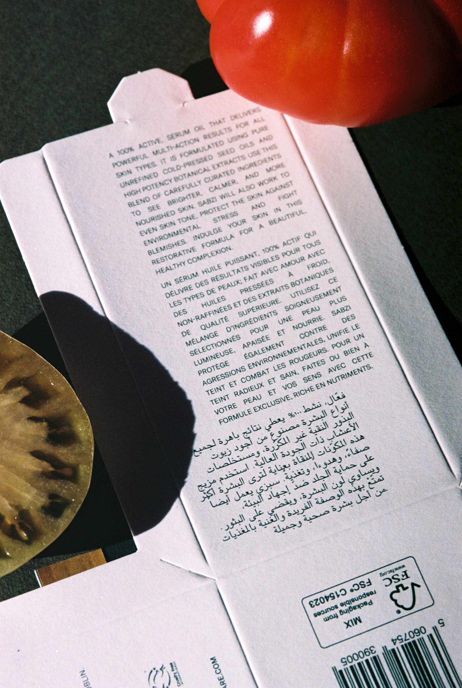


Supper Club's toned-down colour palette is inspired by rich earthy colours of spices and herbs found in the product's ingredients and the landscapes of Iraq. Golden foil was then added to create a strong contrast to the packaging and the product itself to add an extra layer of sophistication and a hint towards the richness of traditional Iraqi arts.


The packaging was designed to be a big reveal. A more minimal exterior reveals a darker and deeper interior when the product blossoms out from the box as its four sides gently fall to the sides.


Photos by Adrianna Glaviano