
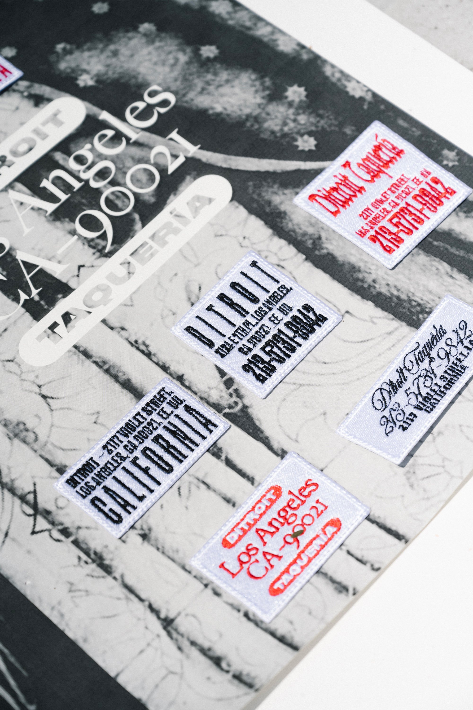
Ditroit
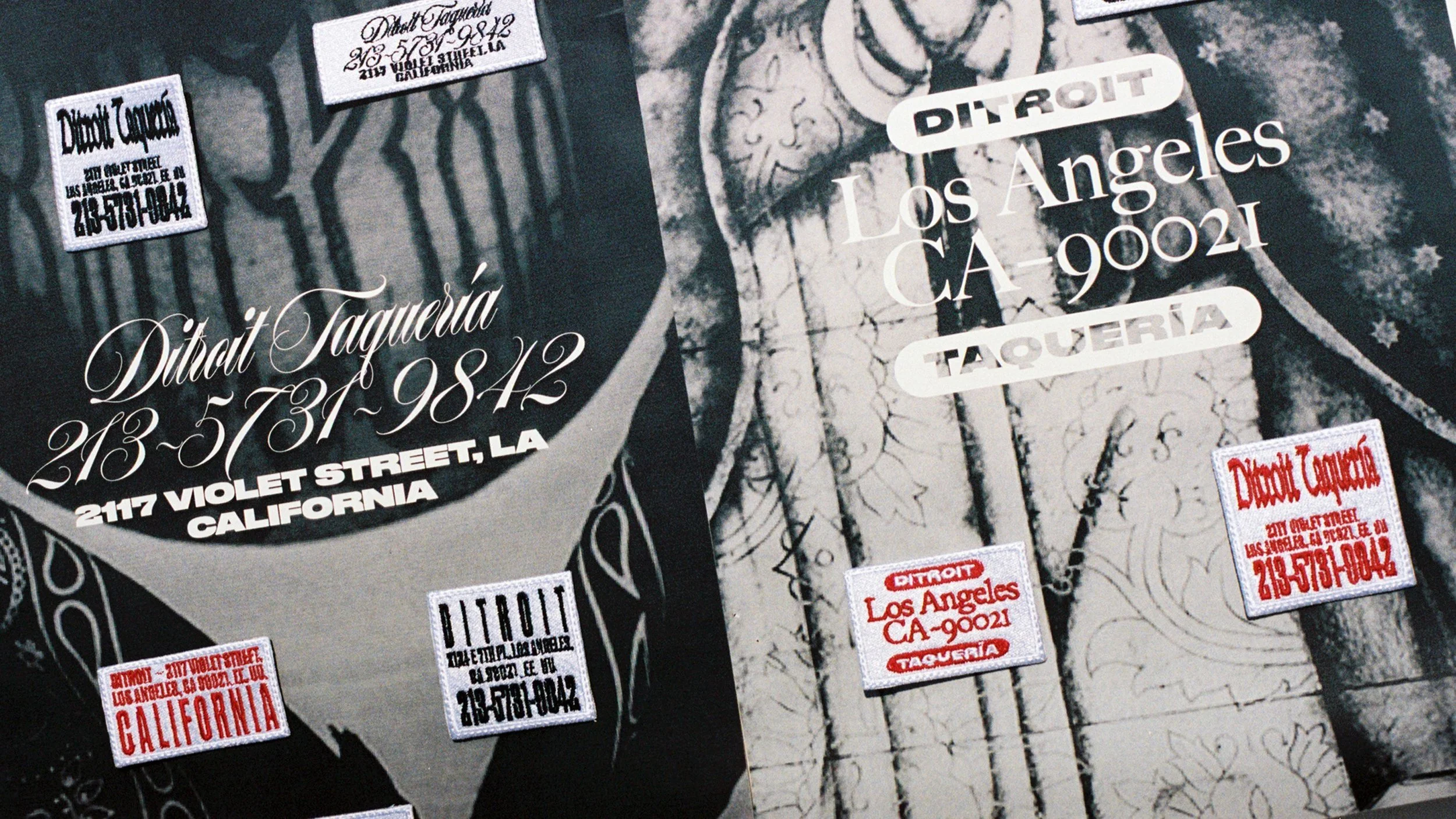
DITROIT
Ditroit is one of Enrique Olvera’s latest restaurants outside of Mexico, located at the back of his more upscale Damian in downtown LA.


The taquería takes its name from the Mexican slang ‘por ditroit’ – through the back – alluding to Ditroit’s location in Damian’s back alley.

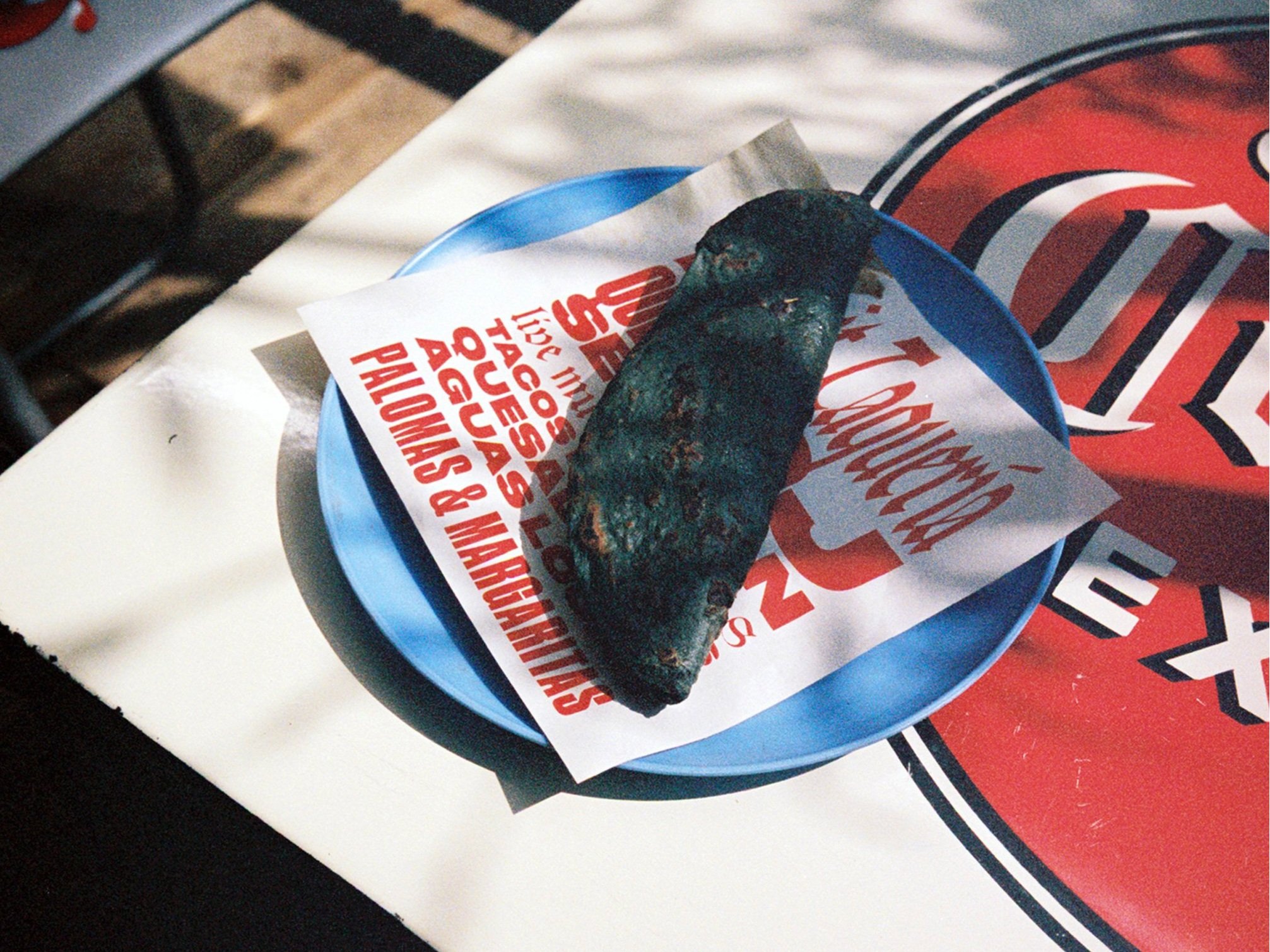
Ditroit looks to be an authentic street taqueria, like the thousands found in Mexico City’s urban maze, but with high quality ingredients and sometimes accompanied by live music and outdoor events.


For the identity we borrowed from LA’s strong Mexican-influenced culture: an authentic Mexican vibe, mixed with the laidback attitude of LA gives the branding a harsh contrast and independent look and feel.


The contrast of the two cultures is seen best in our typographic system. We combined multiple bold logotypes to be used interchangeably with other contrasting typefaces, adding a little chaos and nonchalance and bringing out Ditroit’s very natural and real personality. The mix of inspirations for the type system comes from different signs found on Mexican taquerias as well as from American fast food restaurants and diners and contemporary youth street culture in LA.


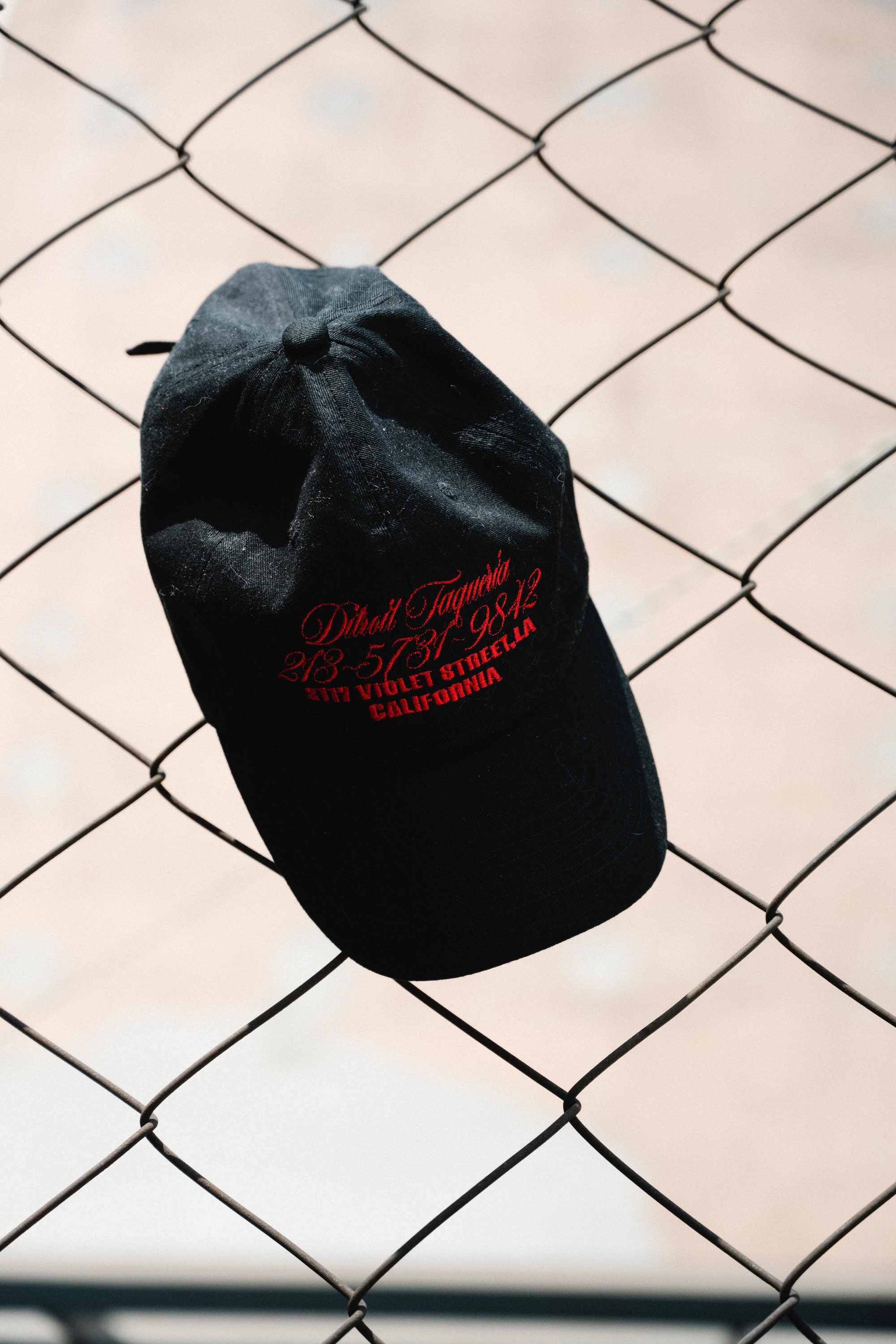
The bright red monotone of the branding makes Ditroit’s kitschy personality instantly recognizable, feeling both unique and truthful at the same time. The branding system itself was developed with practicality and ease of use at its core.


Photos by Adrianna Glaviano