
Al Coro
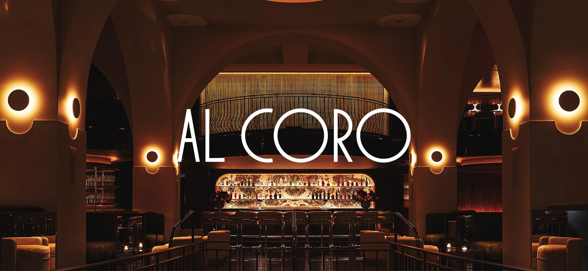
AL CORO
Al Coro, New York City's two Michelin stars dining destination. It proposes an experience around food that transports to Italy's intrinsic joyous celebration of life in every bite. The place's energy is vibrant yet laid back, providing the perfect setting for memorable and festive nights, of great food and great company.


Alluding to Italian cuisine, where superb flavours are achieved through effortless combinations of high quality ingredients, we proposed a paired down identity, of simple but strong elements that come together harmoniously.


A strong reference for Al Coro's brand identity were three pillars of Italian cooking history, three cookbooks from different eras that are an imprint of Italy's cultural, artistic and gastronomical identity in those periods. Starting off from the ancient Re Culinaria in the 1st Century AD, useful for reconstructing the dietary habits of the ancient world around the Mediterranean Basin, continuing with Pellegrino Artusi's La Scienza in Cucina e l'Arte di Mangiar Bene from the 1800s, a landmark work in Italian culture during a period of national transformation and unification, and ending with the Manifesto of Futurist Cooking where the aesthetic ideals of Futurism from the 20th Century quickly penetrated the realm of gastronomy, imposing those very same ideals of speed, movement, progress, creativity, and colours.


“Cooking in itself is a science... which only the best are able to transform into art.”
-Pellegrino Artusi


We are removing the boundaries of time and space in Italian cooking and culture, to create a more imaginative, creative and elegant identity.
The logotype draws inspiration from the strong character found in the street signage from Italy, while the type system combines styles and eras, through sans and serif typefaces, referencing both classic cookbooks and street lettering.


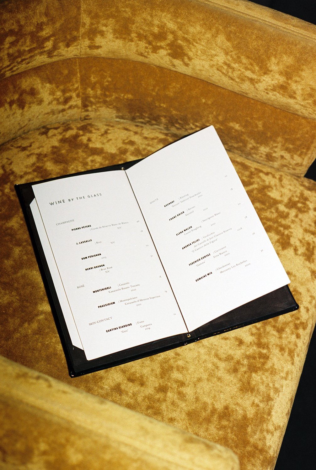
To accompany this subtle elements, we developed a series of colourful patterns, inspired by the restaurant's architectural style and its arches, while the menu's rhythmic layouts evoque musical notation.

Photos by Adrianna Glaviano and Adrian Gaut